ALIVE Online Learning Platform Dashboard
INTRODUCTION
This article is to show the process of how did I design the instructor's dashboard. Dashboard in an assemble for all of the functions for instructors, which helps alive users manage their accounts and make long-term and instant strategies for their teaching and business.
I designed the dashboard from the scratch. Working with my pm and programmer co-workers revised and iterated different versions.

PROCESS
PROJECT BACKGROUND
Adaptive Learning in Interactive Visual Environment
ALIVE (Adaptive Learning in Interactive Visual Environment) is a web-app that allows anyone to teach anything to anyone anywhere in the world in any language. ALIVE is aiming to truly democratize the online education industry by providing course authoring tool that is simple to learn, use, and access, and enables collaborative course development for faster production at no or very low-cost removing the entry barriers for educators – especially those from developing countries. The universal app store of ALIVE will enable everyone to easily access the quality interactive learning that is customized to incorporate mastery learning techniques and provide personalized learning experience to accommodate various types of learners.

PROBLEM STATEMENT
Instructor should be instructor's space which include every functions and informations that instructors need. Three main functions are included in the instructor's dashboard.

Less human interaction : Simple UI and clear navigation
The more content need to be shown the simpler we should have. UI and navigation is like the map and transportation. To make our user not get lost in our big land, we need to carefully design the map and the transportation system.
PROBLEM SPACE
Insight 1
The dashboard is a brief introduction of Crucial Information
Balance Advanced information and general information
Based on the discussion with project manager and programmers during the product design period, I have a clear view of what information should be included and what kind of data can be collected from the technic side. The informations need to be shown is very large. So I must identify what is the data that the most users need to know, and what is the data only some advanced user need to know. So we could make a decision about what can be shown in the most important position to fulfill most people's intention.


Clear instructions: No-hands on education or marketing experience needed
The users of Alive come from different countries, languages, cultures and education backgrounds. There are many instructors are not from the education or internet industry. If we directly show them the data, they might not be able to understand the meaning behind the numbers or charts, so they can not make use of the analytics function. We must make clear instruction and specific description to every section in the website.
Use the right chart to show the data
Good UI and navigation will help users find the the data they want to see. But data visualization is the last but not the least part for users to get the information. In this case, number is not the only field of the chart.There's also time period, types, duration, operation, events and so many different kind of fields. For each point of data, we need to select a angle and a right chart to show the data.
Insight 2
Don't let user think: help our users identify their goals


LEARNING AND THINKING
GOOGLE ANALYSTICS & Youtube studio (beta)

During the research process, I experienced and studied different websites' analytics dashboards. Google analytics is very professional for website traffic analytics. It almost covers every metric that might matter to the user. However google analytics is designed for users equals to or above middle technic level.
USER SPECTRUM
Adaptive Learning in Interactive Visual Environment
Based with the discussion with the marketing department and project mamager. Our target users will be 3 different types.


Make it easy to use for everyone (including no tech background user). Simplify user interaction. Users could find what the core functions within 3 clicks
Based on the interviews of 5 College educators (Professional Educator) , 3 traditional industry workers (never teach online before but have will to teach online ) and 2 online education instructors (who have already have experience of online teaching). I have the priority of the features that matters to our potential users.
Strategy & Execution
Design Goal:
Priority of Features
Instructor Dashboard

Data Analytics

Main Feature and Structure
Information Architecture

Wireframes (Part)


Screenshot of Hi-fi design (Part)


Interactions
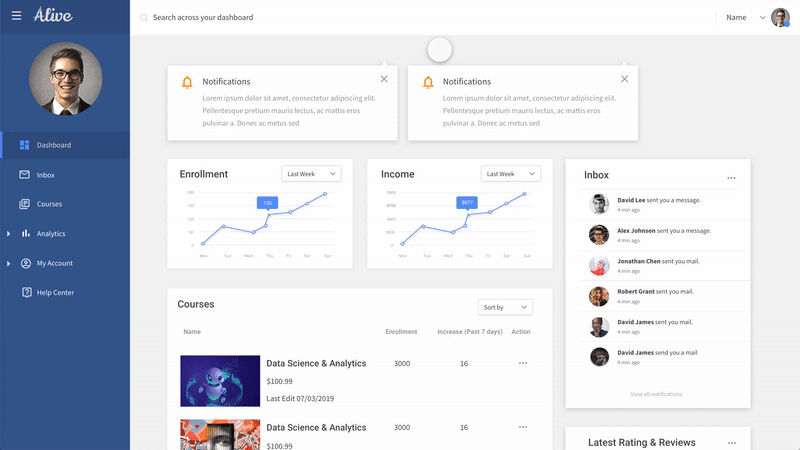
Notification
The floating notification box will inform Users with important website news, account updates, and marketing information.
This section is helping build a helpful community environment. And filter important news, so users won't miss any important information.
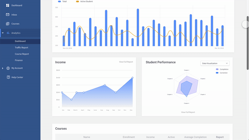
Chart Transition
The transition from the same chart style has a transit animation. This animation helps build a consistent visual environment for users.

Time Range Selection
All of the charts could be customized with different time ranges. By selecting the start date and end date on the calendar, the user could get the data of a particular time range.
Also, below the calendar, there's a drop-down menu. Users could conveniently select a time range like last 7 days or last 30 days.
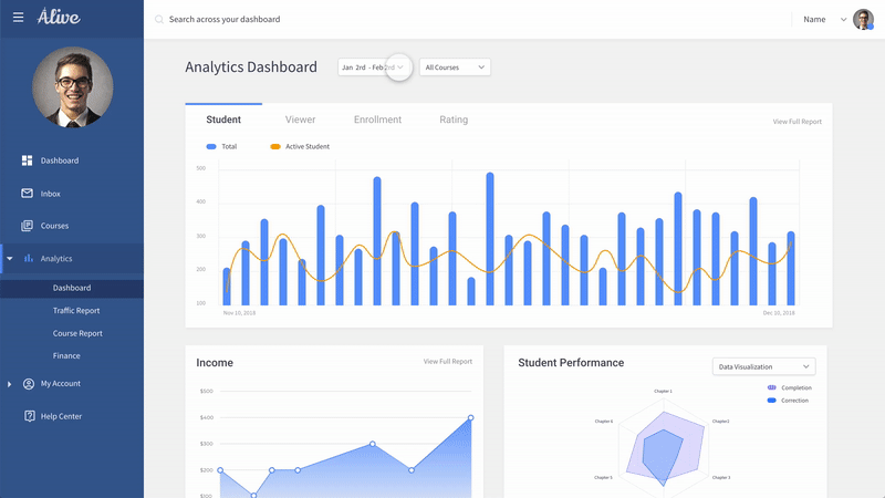
Data Source
In the analytics dashboard, we hope to cover different kinds of data. Some data are time sensitive, so are not. Student performance data is not time sensitive, but it relies on different courses. So we use a quick drop-down box for the user to select the data source.

Find the Data
The hierarchy of the data is very clear. All of the menus and options are at a very obvious position. The interaction of data visualization is based on the user's habits.
To show different features of different data, we used different charts. So users could get the information from the chart easier.
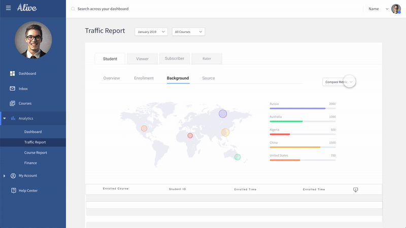
Compare Metric
This is an advanced function for users with special needs. Besides the normal chart, the user could add new metrics to the chart to build a new chart and get new features from the data.
Almost all of the data in the menu could have a combination. These charts are not shown on the website by default but could be created by the user.
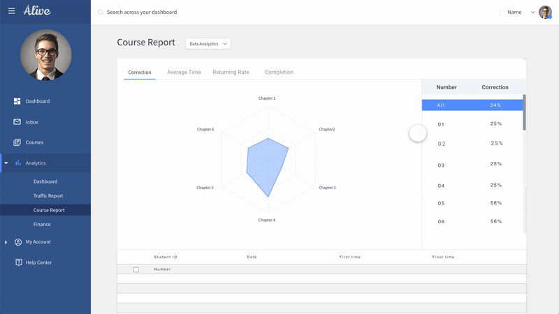
Student Performance
Student performance is related to the courses. When the user selects different courses, they could see the performance of the student and the different answers that the student has.
Also, they could select different students to see their performance.