Chromati: Transforming Color from Sound to Sight

Overview
This is our inclusive design project which is aimed to solve the inclusive design challenge that was curated by Microsoft. The challenge is about designing a product, service, or solution to solve for exclusion in a diskless workplace.
The Chromatic is in the form of glasses we designed that facilitate communication between a hearing-impaired person and those around them through speech and text.
Our inspiration was a surgeon with hearing impairments. The main feature was a display that shows the user what someone else is saying on screen. It also has other capabilities, like connecting to a hearing aid, typing out something to say, and showing the user if someone behind them is trying to talk to them. We went about solving this problem with extensive brainstorming, contextual inquiry, and user testing. We iterated each version of the design based on what we learned based on our research.
Challenge
The main part of designing something is running into the problem, and working out how to solve them. It is our jobs to figure out how to solve these problems so that the user doesn’t have to. One major problem, in the beginning, was whom we were designing for. We began designing for a vision impaired uber driver, and we mainly focused on color blindness. After we presented this idea we got important feedback. Firstly, many people who are color blind drive just fine, so it is necessary to design for this problem. Second, self-driving cars are a quickly growing technology that is certain to become a major part of life in the next few years. There is no point in designing for a visually impaired driver when they could just use a self-driving car. So, we changed our idea and came up with a hearing impaired surgeon. There was not a solution for this already, and someone with hearing loss is more excluded from being a surgeon than someone with color blindness is from being an Uber driver. We felt that this new idea was more aligned with the purpose of the design challenge.
Context
There have been lots of applications for hard hearing people and people who use ASL, however, most of them are mobile applications and there are not many applications for professional use or for the user who has a special occupation. After doing the background research, we decided to design an inclusive product that can help hard hearing people and people who use ASL to communicate more convenient.
Goal
Our initial goal is to design for a surgeon who communicates using American Sign Language (ASL). After extension to broader user spectrum, our final goal is to design a product that will improve the overall communication between hearing impaired people and society, and reduce the inconvenience and provide opportunities for them to engage in some occupations that exclude them previously.
Context Inquiry
We went to the Center for Hearing and Communication, and meet with the advisor. We have introduced hearing aid and information about hearing loss people. Most of the people are not complete loss of hearing, they are unable to hear the sound of a certain frequency. So if hearing aid used to alter the frequency and draw near the distance, somehow voice can be heard. And those who can’t speak are only a small part of hearing loss people.
We are also introduced several kinds of hearing aids. There’s a pen-like hearing aid, if the user passes this to the person he or she wants to speak to, voice can listen more clearly. And there’s also a device for the conference.
User Spectrum
For the user spectrum, we recognized 3 major categories viz., permanent, temporary and situational. The permanent condition is that of a hard of hearing person by birth and someone who uses the ASL. The temporary condition can be hearing loss due to age or constant exposure to high volume. The situational condition can be that of ear infection or ear ache.
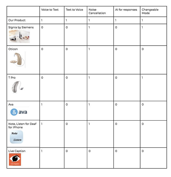
On doing research, we found that two of our major competitors were hearing aids and mobile apps. Hearing aids provided solutions to help people with temporary and situational discomforts, whereas mobile apps provided support for all three elements in our spectrum. But our product’s USP was that it offered AI for responses and also text to speech functionality.

Problem
Because the realm of hearing impairment is so vast, we divided our problem statement into three parts.
1. Frequency
Consonants like “s,” “h,” and “f,” have higher frequencies (1,500 to 6,000 Hz) and are harder to hear. Consonants convey most of the meaning of what we say. Someone who cannot hear high-frequency sounds will have a hard time understanding speech and language.
2. Distance
Related to frequency, when a sound travels far to reach a person, much of its high-frequency detail dissipates along the way. Over long distances, obstructions such as land masses, buildings, and even air in the atmosphere all contribute to squash those high frequencies
3. Reliance on Lip Reading
Hearing-impaired people also rely on lip reading a lot. But when they can’t see others’ lip movements, problems arise. Face masks or other physical obstructions make it impossible to interpret via lip reading.
Solution
1. Eye Tracking
This would be used to select words, phrases, and settings in the Chromati interface.
2. Keyboard with autocomplete phrases
The user would type out what they would like to say with a virtual keyboard. Hand movements would be registered through the camera on the front of the frames.
3. Text to speech
The words that the user types would be spoken by an AI voice incorporated in the glasses.
4. Speech to text
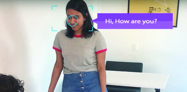
The Chromati can pick up what other people are saying, and convert their dialogue into screen-based text on the interface.
5. Hand movement tracker
The glasses track hand movement so that the user can select specific words/phrases and select settings in the interface.
Low-fi Prototype
In order to make our prototype testable for users to engage in,we began creating the low-fidelity mockup of the interface design and worked on making the prototype with various functions that we could present to users to navigate.
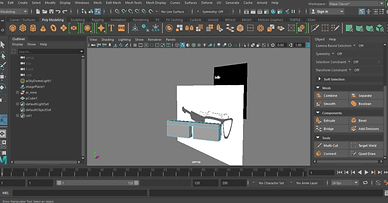
We made the first mockups of the physical prototype of the Chromati by using 3D Maya. The design is very clunky and meant to just show the concept of the shape of glasses and examples of AI phrases.
Our second stage of lo-fi prototyping for the interface focused more on showing the actual interactions. Mockups were initially made in Axure first, then images and detailed text were added in and compiled into a prototyped Marvel app that shows an example of the interface. We had users test the Marvel app to see how convenient it was for them to locate the different functions.


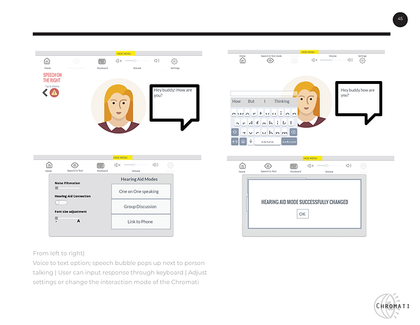
This is our marvel prototype: https://marvelapp.com/cg935bj/screen/41261215
We also made 3 videos as our demos of low-fi prototype. The videos used editing and acting to simulate what the glasses would look like in a day to day conversation. With these, we were able to simulate the two most important parts of the glasses, and test our users with them.

User Test
After the first round of our user testing process, we learned that the initial prototype of the product is too confusing as the symbols are not easy to understand. Moving forward, the design of the interface needs to be cleaned up and labels on our design need to indicate when someone is wearing the glasses. Overall, we want to improve the ease of use of our device as it has many functionalities which can get confusing. Some feedback and suggestions that we got from our users including:
• Include more back buttons.
• The ability to change the keyboard should be more visible.
• Having to press the home button twice is tedious.
• The icons did not make any sense. Navigating the interface was a bit confusing.
For subsequent testing, we improved on our design for the second round of user testing by simplifying the interface. We deleted some screens, and we got rid of some unnecessary features. The users that we tested noticed. We got higher ratings on our design from the second round of user testing than from the first, and when asked what they liked about our design most said that the design was simple and easy to understand.
HIGH FIDELITY PROTOTYPE
Based on our user tests and low-fi prototype, we made our hi-fi prototype. Users can use eye tracking or hands movement to select and swipe elements on the interface. It has 4 modes for people to choose based on the different situation: one on one mode, small group mode, crowd mode, and phone call mode. On top of that, users can either type the dialogue they wish to say or they can have their voice carried out through the AI voice or choose relative phrases based on the AI system database and translate those to voice. This function helps users who use sign language to articulate verbal words so that even people who are not fluent in sign language can understand them with ease.


For one on one mode, we made a single dialog box and human recognition symbol to help user see the text more clearly.

For communication in a small group setting, we simplified the dialogue box to only speech bubbles so that user can easily see what each person says.
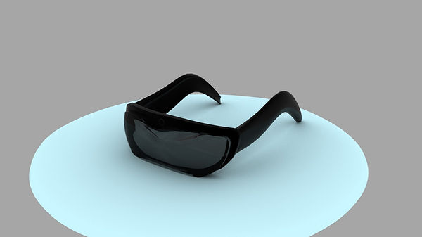
For our high fidelity physical prototype of Chromati, we developed a sleeker and more compact version of the model through 3D renderings.
In order to make the Chromati look more discrete, we coated it in a sleek and all-black color. The glasses themselves sit lightly on the user’s face so there is not a much physical distraction when wearing them. It was modeled in Maya and Blender so that we could have a greater sense of what the glasses would look like.
And here are our final demo videos based on our previous persona. We simulated three scenarios of wearing Chromati using 3 modes: one on one mode, phone call mode and crowd mode.
Reflection
This project was a lot of work. Getting through each iteration, doing all the research, talking to users took a lot of effort. However, this effort was worth it. We successfully managed to create a design that works, and that has been carefully thought through. That is something to be proud of. Managing a huge project like this with a large group was a great experience, and we can all take something positive away from it. Designing for people who are unlike us is an important task. It is important for a designer to understand how our designs can impact other people, and to carefully consider everyone who will be using our design. By undertaking this project the whole class has learned the importance of designing for everyone.