Worthix Analytic Dashboard
What is Worthix Analytic Dashboard
Worthix is the world’s first self-adaptive survey built with artificial intelligence to measure customer decisions. Each project has its own analytics dashboard. Users will be able to explore the analysis result of your project, import additional data, and filter data.
My Role
As the sole UX/UI designer of this project, I was responsible for
-
Designing and shipping the enhancement to the data exploring experience.
-
Designing ahead to influence the future product roadmap.
-
Conducting user studies to understand scenarios.
-
Communication with stakeholders across different company departments (business leaderships, PMs, Sales, and customer support) to get feedback on the ideas.
-
Working closely with data scientists and web developers during the design and development process.
Understanding the problem space
When I joined the product team, the product was going through a developer designed dashboard to a professional industrial product. The main problem would be:
1. Most people need training to understand the data or concept on the dashboard, even though they understand the methodology well: Complex datasets and concept have a steep learning curve

2. Improve the cross-analysis ability of the dashboard.
“ I need to access macro and micro data and do cross analysis to find out the insight and communicate the result clearly to others”
--- Marketing Analyst
3. How to make the charts more intuitive and easier for users with different backgrounds to generate insights.
“ I need to get informed on reasons behind customer’s decisions and take quick actions to improve the customer experience”
--- Store ( project ) Manager
4. How to build up in-dashboard communication to help users solve the problem more efficiently?
“ I need to explain worthix methodology from the dashboard and communicate the project result with clients”
--- Worthix Customer support team
Old Dashboard
“I am frustrated to see disordered data on the dashboard and it will make it tougher to explain it to people without background knowledge. I don’t want to download data and do cross-analysis on excel every time ”
--- Marketing Analyst
“ I feel the statistics of dashboard data is very hard to understand in the beginning and it’s difficult to analyze the data by myself”
--- Store ( project ) Manager
“ We have thousands of users and it’s overwhelming to explain or communicate. But when a problem occurs we want to respond to it as soon as possible”
--- Worthix Customer support team


Structure of old dashboard
Screenshot of old dashboard
Research
Question: What prevents users from understanding the dashboard?
Two Subjects (Act out scenario):
Report a dashboard to the lead
One Subject:
Read a dashboard
User behavior observation:
Goal:
Find out how do users understand and explain dashboard data
Test Scenario:
Three+ Subjects (Act out scenario):
Discuss the result as a group
Result
Only 3/21 Subjects of the research can fully understand the dashboard data
Only 5/21 Subjects of the research can understand the data after a walkthrough
Deconstruct the dashboard component


-
In general, Users have difficulty in understanding the Bi-Directional Bar Chart.
-
Users have a better understanding of the statistic data than the analytic data
-
Some data visualizations don't look intuitive with real data

Usability testing Result
Statistic Result with Bi-directional bar chart
The reasons why users can't understand the dashboard
Insights for potential solutions
1. We need to revise the dashboard structure to avoid intelligence overwhelming
2. The dashboard Structure needs to be changed to tell a clear story
3. Minimize and revise the dashboard content to help the user understand
4. Understanding the concept of the potential increase and decrease is the key to understanding the dashboard
Success Metircs
Most of our objectives were standard such as: User satisfaction rate, maintenance efforts, lower bounce rate, higher conversion rate. But I am more excited about the following metrics:
1. Adaptive Learning Curve for different personas
Users with different personas could achieve their goals and feel comfortable to learn and use the dashboard

2. Data ---> Actionable Insight Conversion Rate
Data visualization should be intuitive. We will measure if users could generate actionable insights from the charts
3. Trust Building
We will measure if the design meets our and our clients business objectives.
As a customer analytic product, data visualization on the dashboard should be accurate in representing what it says.
Solutions
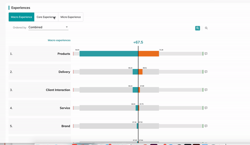
Multi-dimension Dashboard Structure

Vertical: Use Story-telling Structure to strengthen the relationship between components
Use storytelling methods to indicate the relationship between each component. In this dashboard, we reveal the data gradually. In the beginning, we displayed the result of the scoring questions. When users keep scrolling they will see the analysis of machine learning results and get insight into how each sentiment influences customers buying decisions.
General User
Managers
Analyst
Technician
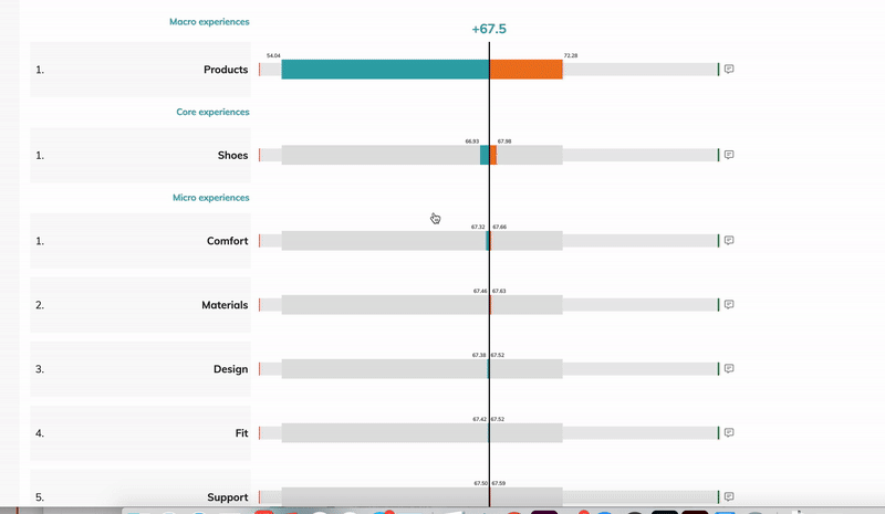
Horizontal: Enrich actionable insights by visualizing data in different charts
We use the tab menu to contain different charts for one data point. The feature of different charts could reveal different perspectives of data. So even people don't have a very strong analytical background. they could generate insights directly from the dashboard easily
Depth: Enable users to breakdown the data and get more Precisely insight
We used Interactions and dashboard settings to help users, deep-dive, into the data to find out reasons for reasons. The depth of the dashboard enabled the advanced user to use the dashboard more freely
Vertical
1. Story Telling Structure to help users understand

Vertical Structure helps users understand:
All Metrics are calculated based on Worthix Score
Use the same chart for first-level data. So if users understand one of them they could understand the others. Vertical Line indicates the worthix score

New Structure of the dashboard
Horizontal
2. Increase the diversity and clarity of data visualization
-
Bi-Dimensional Bar chart
Use a more meaningful color coding to help users understand the chart

New Version

Old Version
-
Scatter chart/bar chart of competitors
Consider the User's reading habit. increase the interactions between charts to decrease users cognitive efforts to memorize.
Bar chart to show competitor's impact on each driver
Scatter chart to show in general how's your product perform among competitors
-
Three different charts for brand identification
Different charts reveal different features of data. So it's easier for users with no analytical background to generate insight from the chart


Depth
3. Use interactions to help visualize ML data structure
Interaction designs enable users to breakdown the tags and deep dive into the experiences. LUCI (Worthix AI) enables the system to recognize the keyword from open question results and group them into tags (experiences).

-
Linner Breakdown
-
Categorial Breakdown
-
Categorial Breakdown

-
Linner Breakdown
-
Find Raw Comments

-
Zoom in and zoom out
4. Revise Content Design
Instead of directly display the explaining information on the dashboard we hide them into info bubbles. and revised it to a more human language to make it understandable for no statistic background user
5. Build up cross analytic and supporting system
Users can customize filter and weight settings to do cross analytic
6. Note Function


Prototype


Method:
Test on Tableau with real data


Findings
Tableau's result indicates the number of sentiments in one datapoint is very close. we need to add a zoom-in function otherwise the difference between each bar is not obvious
Add a Zoom in / zoom out function
Method:
I conducted A/B Test on two different color palates


Finding:
Even though involve gradient color increase one dimension. on this chart. Users comment that gradient color is not vert distinguishable on some screens so they prefer to use a categorial color palate. Most of the users select the categorial color version.
Some Challenges During the process
Challenge 1:
Data visualization looks different with real data
Challenge 2:
Color Palate of competitor charts is controversial
Iteration
In the End

Most users are able to understand the basic component of the dashboard. For some advanced analytic concept, there's still a number of people have difficulties to understand. However, those complex analytics concepts are not prepared for general users. Most users feel comfortable at their knowledge level.
So we think it's a successful Design.
Usability testing result
Challenges faced and lessons learned
During this process, we encountered several challenges. Since we were proposing something that was completely different from the current system, it took a lot of convincing other stakeholders and explaining to them why we are doing this in the first place.
This version of the dashboard has already been implemented and we really got lots of positive feedback from all of our clients. I am super proud that it doesn't take too much time for users to understand the complex worthix methodology through the dashboard during their first time.